
室内设计公司
+ 关注 查看全部作品联系方式:
西安宜空间设计
2747167529
15591840278
陕西省西安市雁塔区长延堡街道金地·芙蓉世家
作品版权归“西安宜空间设计”所有,禁止匿名转载;禁止商业使用;禁止个人使用。
重要声明:
设计网为开放交流平台,不担保任何私下交易。是否使用本网站服务及资料应由用户自行考虑并自负风险。用户以自己的独立判断从事私下交易行为,将独立承担可能产生的不利后果和责任,设计网不承担任何法律责任。
破壳计划丨Coding Life
设计方:宜空间设计
主持设计师:敖大
设计作品:Coding life丨破壳计划
面积:80㎡
项目位置:陕西·西安
商业空间类型:科技生活类产品店铺
品牌名称:Coding life丨扣钉
主要材料:钢结构、木饰面、玻璃
Design Company: EASY SPACE DESIGN
Chief Designer: Jane Ao
Design work: Coding life 丨 Bre
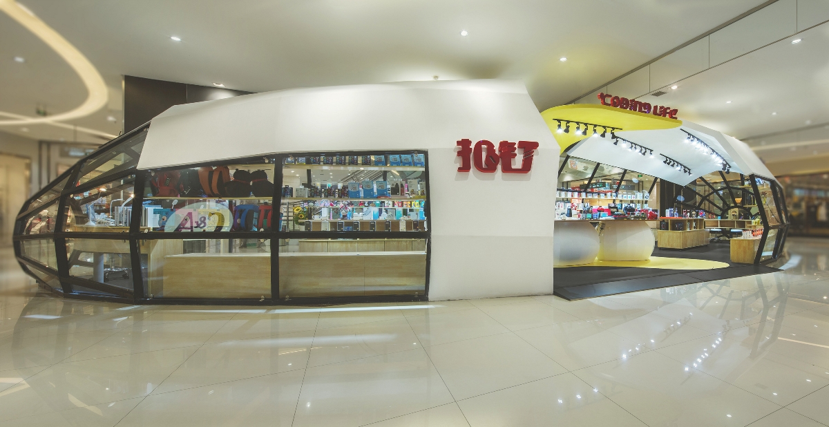
破壳计划,来源于一个创造新生命的理念,蛋壳为了保护,而破壳则为了新生。 Breaking shell program, derived from a concept: breaking the constraints of the eggshell to create a new life. 一个从无到有的设计灵魂,是店主的创业故事。以蛋壳为主题,用破壳做纪念,纪念店主第一次的创业人生,我们也叫它“不破不立”。 This shop is the first entrepreneurship of the shopkeeper. He gave up his old guaranteed job and established this small shop. Based on his inspiring story, the topic of “breaking shell” was selected to commemorate his first entrepreneurship. And this idea also matches an old Chinese saying “Without destroying the old, one cannot build the new”.
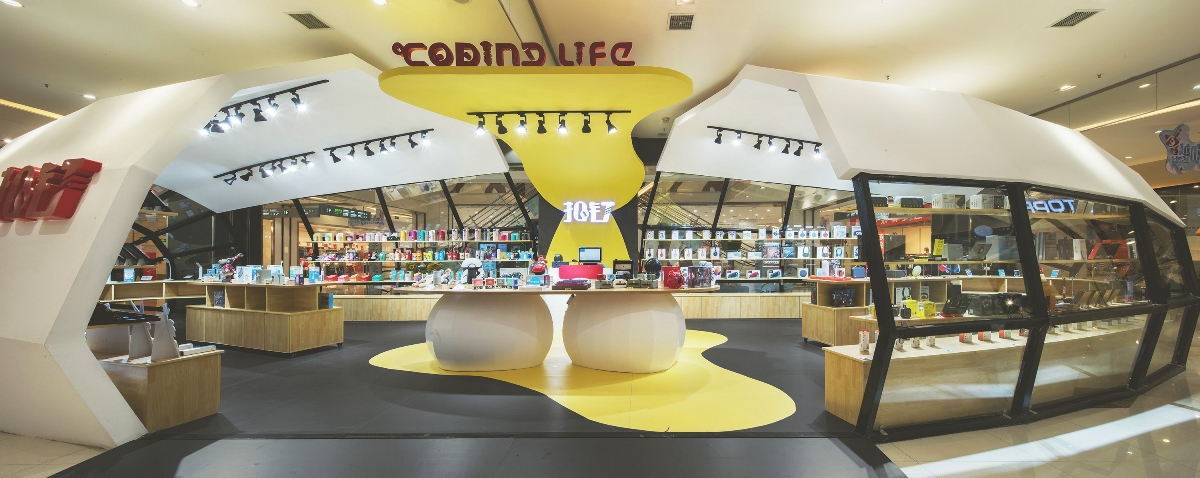
80㎡的商业空间,品牌名Coding life,中文直译「扣钉」。解释为用代码记录生活,品牌产品以智能生活类用品为主打。从logo的设计开始,就点明了我们对这个店铺设计给予的关键词,亲切、主题、科技感。 The brand “Coding life”, with its Chinese transliteration "扣钉", is explained as “recording life with code”. The branded products are hi-tech daily use products, such as headsets, smart toys, AI speakers... Thus,from the beginning of the logo design, we emphasized the kindness and the sense of technology of the key words.
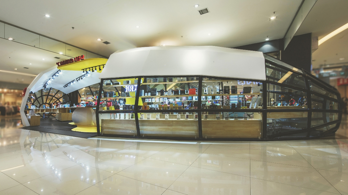
店铺外观设计,以钢结构的镂空为基础,与白色蛋壳弧面衔接,以蛋黄木饰面做延伸,三种元素的组合,完整的建立了一个蛋壳的主题造型,这是一个打破重生的新计划,是主题,亦是店招。 The exterior design of the shop is based on the skeleton of steel structure, connected with the white curved surface of the egg shell which extends to the egg yolk veneer. This combination of the three elements completely established a egg shell theme which is a plan of breaking and birth.
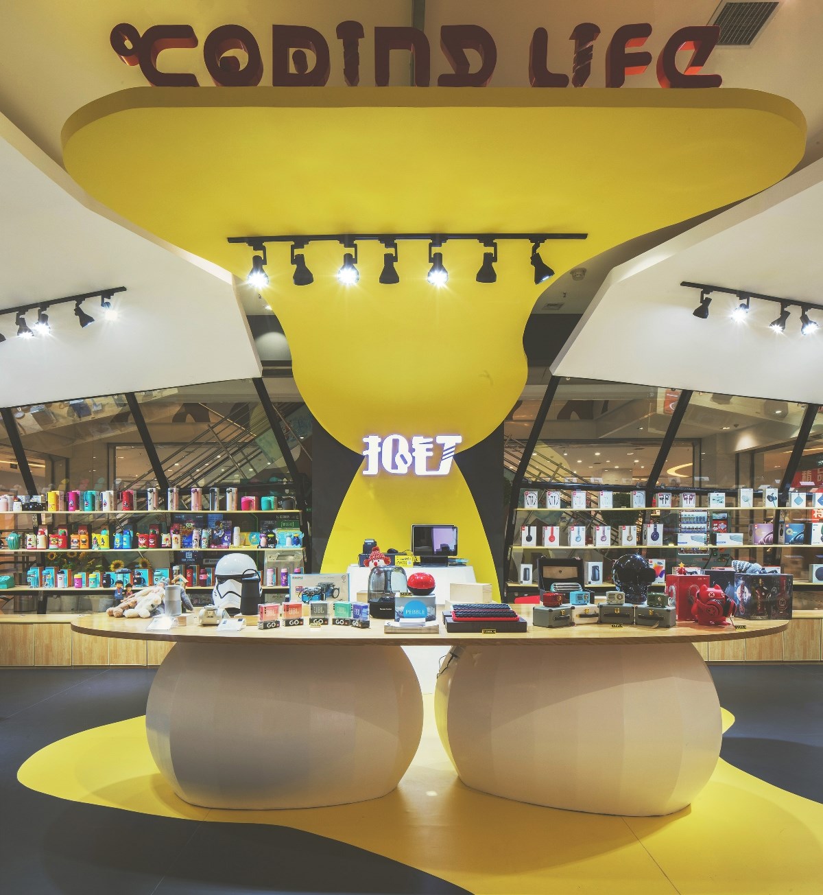
从店铺外部到内部,从造型到使用,从展示到体验,再到收银,原本就不大的店铺里, 我们让动线成为了功能区域的划分线,让产品成为动线上的主角,简洁、不失趣味。 From the outside of the shop to the interior, from the external modeling area to the internal use of the area, from the show area to the experience, and then to the cashier, all presented in this small shop.We let the circulation design divide different functional regions, so making the products as the focus on the way customers move through, which makes the circulation design concise, without losing entertaining.
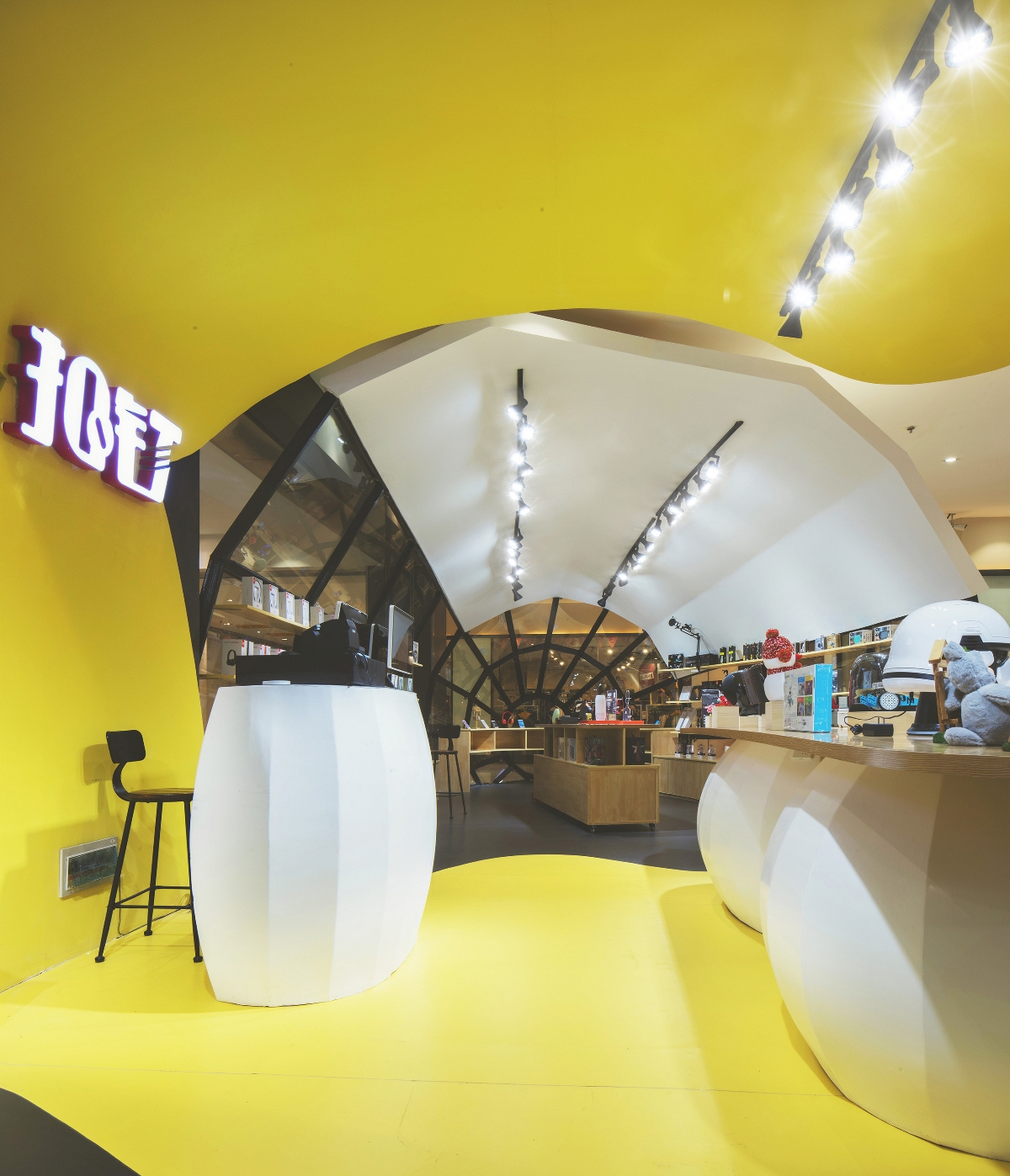
另一方面,整个店铺以最大化的空间利用率,放置了产品展示柜,原木色与白色蛋壳的组合,在灯光的调节下,呈现着舒适亲切的店铺氛围。 On the other hand, a arc showcase was placed to maximize space utilization. The wood color and white eggshell combination, regulated by the lighting, present a comfortable atmosphere in the shop.
作品版权 归 所有, 禁止匿名转载;禁止商业使用; 禁止个人使用。
声明:设计网为开放交流平台,不担保任何私下交易。是否使用本网站服务及资料应由用户自行考虑并自负风险。用户以自己的独立判断从事私下交易行为,将独立承担可能产生的不利后果和责任,设计网不承担任何法律责任。


